01
An icon of squares and triangles
Business
The abstract icon, made of squares and triangles, reflects the diversity of approaches in the company's projects. The straight and rounded corners of the identity balance firmness and approachability.
Brand, brandbook, stationery, applications and website for LH Media House, a film production company specialized in digital content and strategy.
A rebrand built on the Hero archetype: youth and energy with maturity, responsibility and confidence. The name stayed; the visual shift is prominent. Straight and rounded corners balance firmness and approachability. An abstract icon of squares and triangles, heavier typography and a system that runs from the business card to the website.
Consolidate a production company's presence in the market with a more poised and impactful brand, without losing the energy that defines it.
LH Media House is a film production company specialized in digital content and strategy, standing out for driving the growth of businesses and entrepreneurs with a cinematic approach.
Facing the need to consolidate its presence in the market, the company started a rebranding project. I built the brand and the website.
Consolidate the brand's presence in the market.
Blend youth and energy with maturity, responsibility and confidence (Hero archetype).
Keep the name and transform the look.
The abstract icon, made of squares and triangles, reflects the diversity of approaches in the company's projects. The straight and rounded corners of the identity balance firmness and approachability.
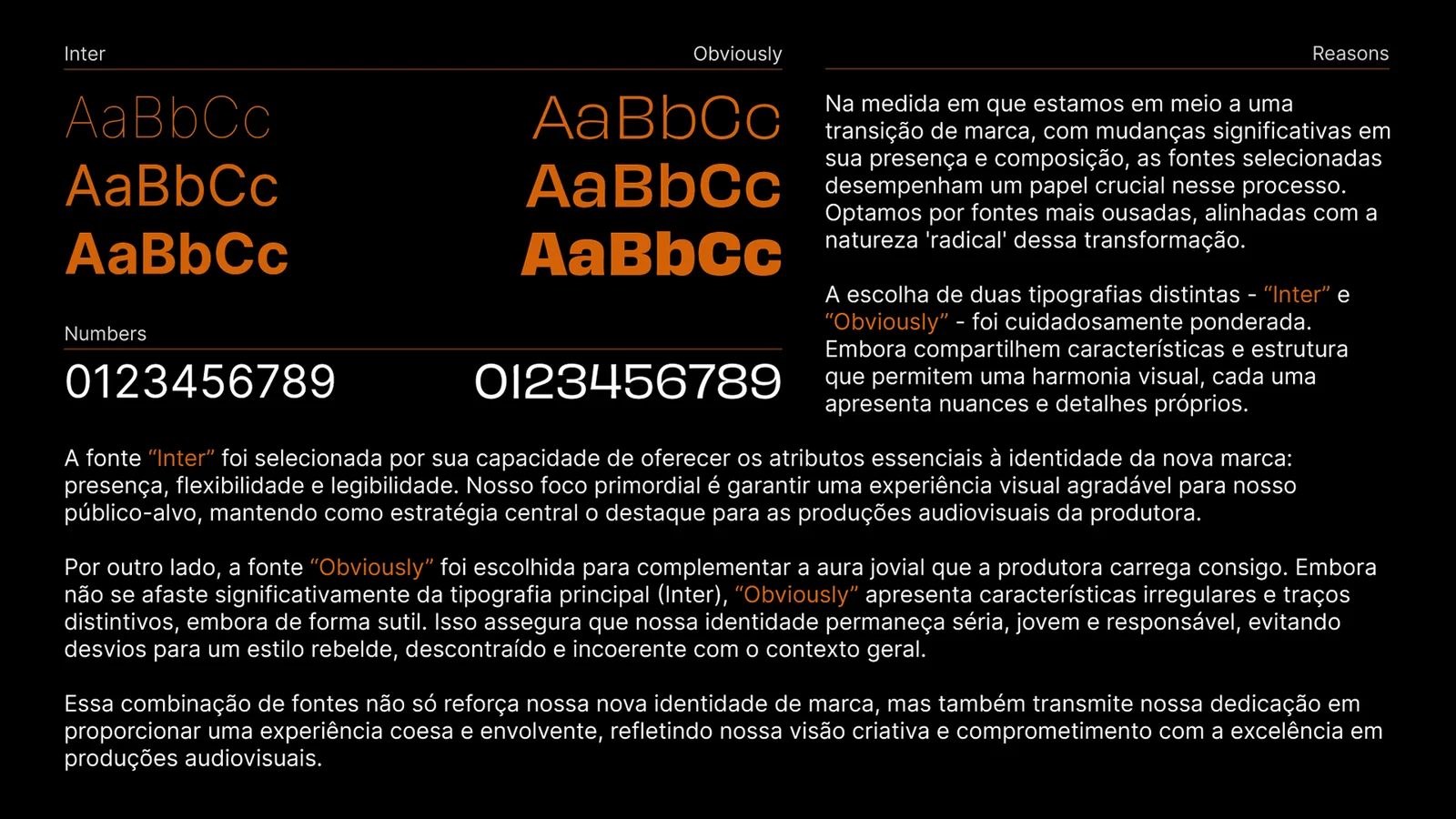
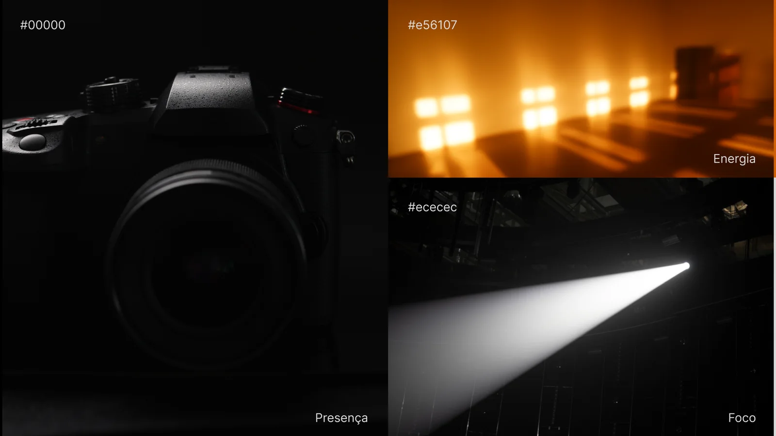
Two families: Inter, for presence, flexibility and legibility, and Obviously, for the company's youthful aura, with distinct, subtle strokes. In color, black for presence, orange #e56107 for energy and light gray #ececec for focus.
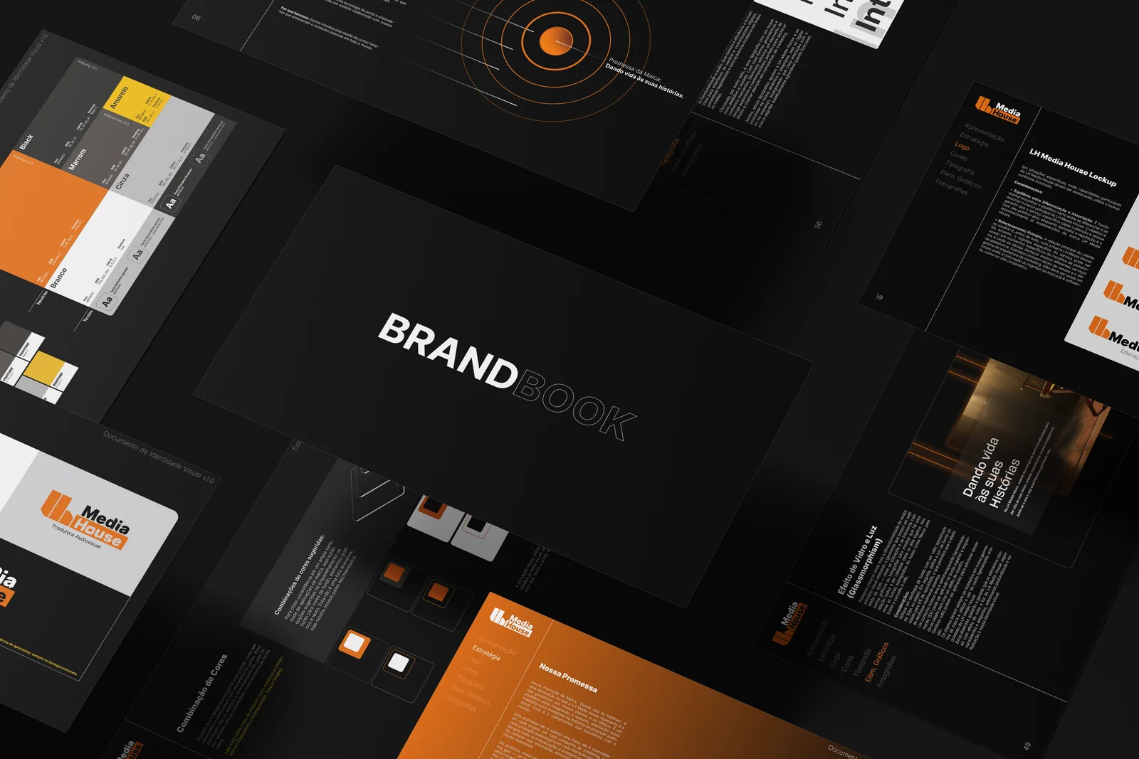
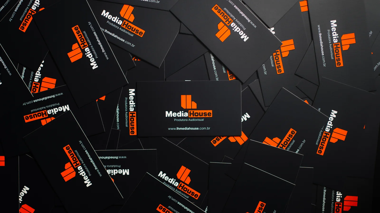
The identity was documented in a brandbook: concept, icon, typography, colors, photography and applications, so the brand stays coherent in every piece.
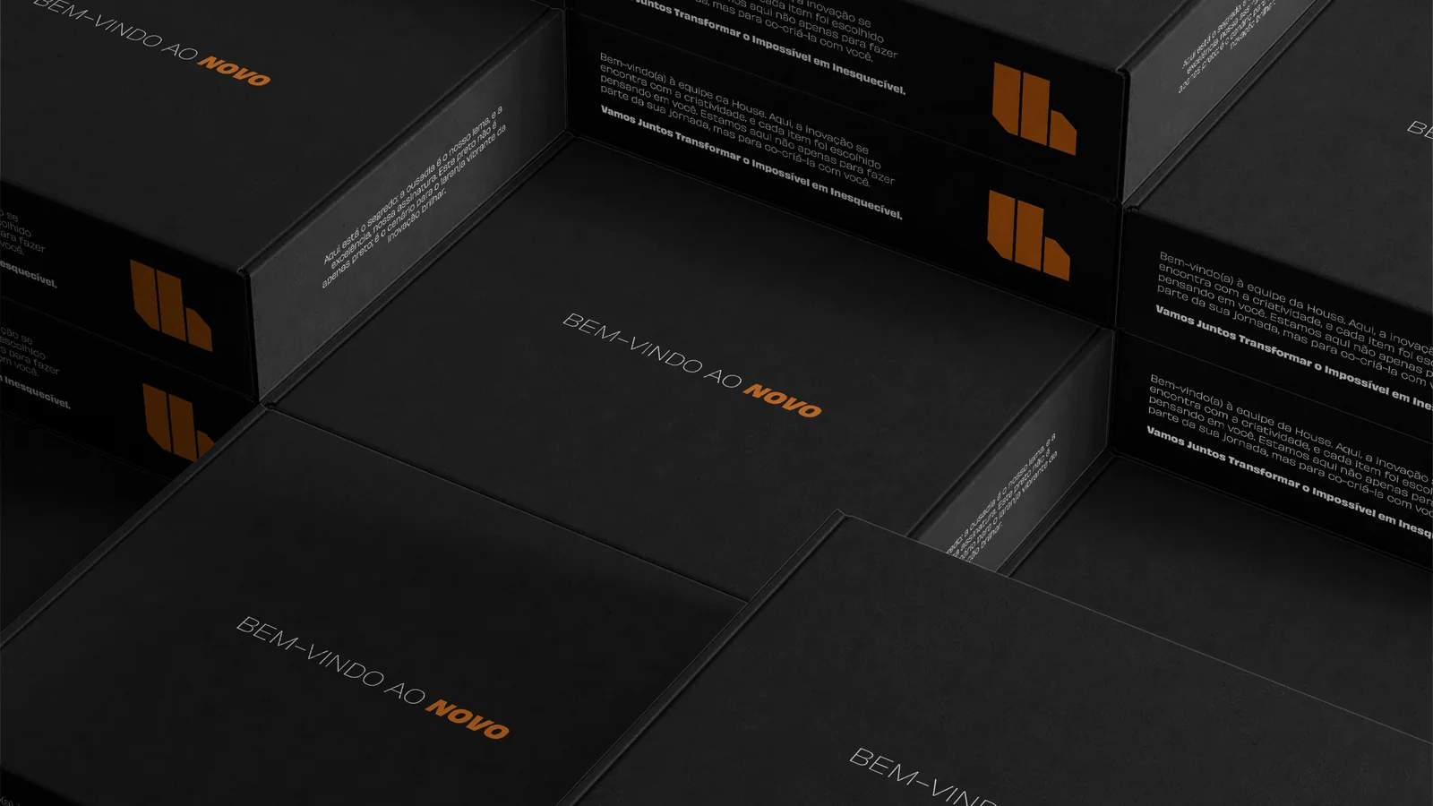
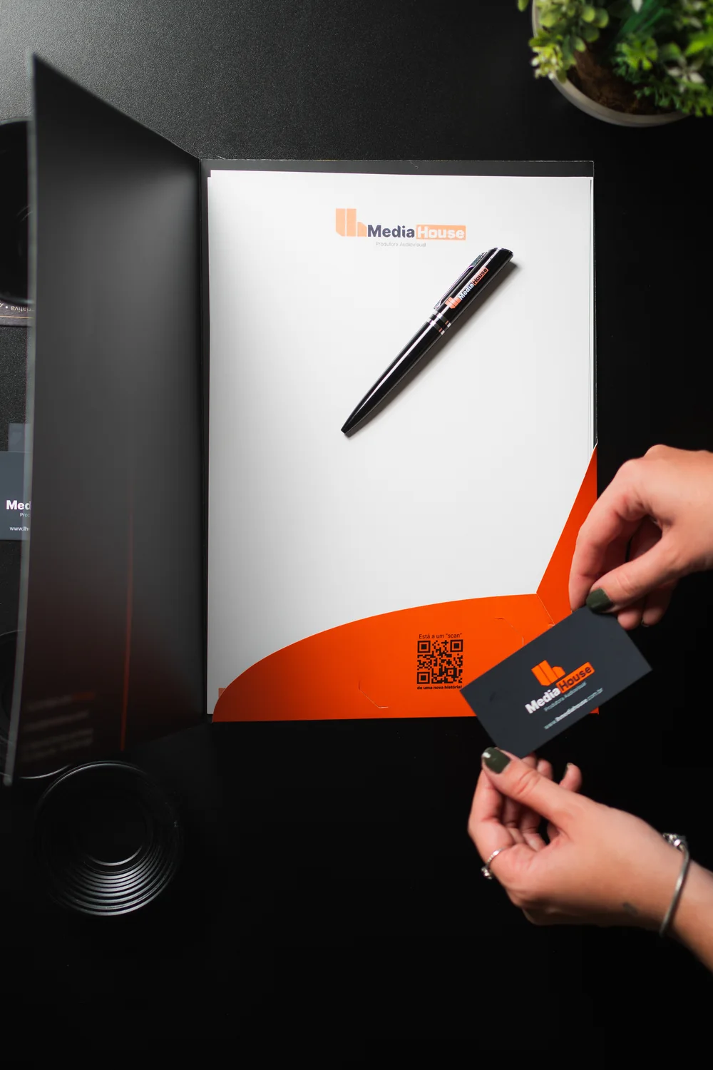
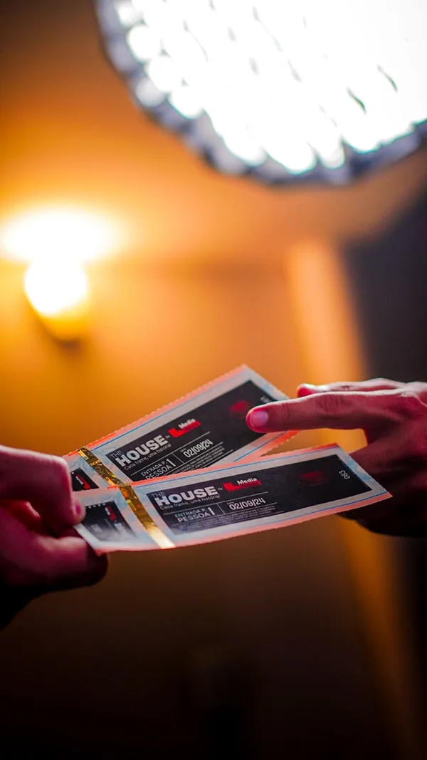
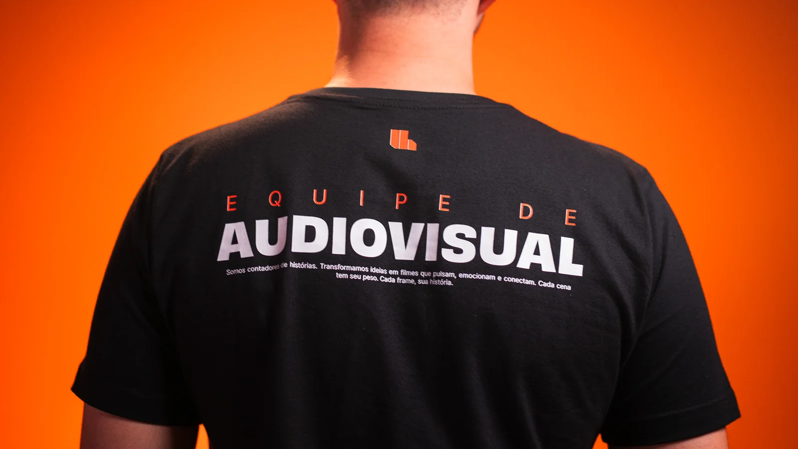
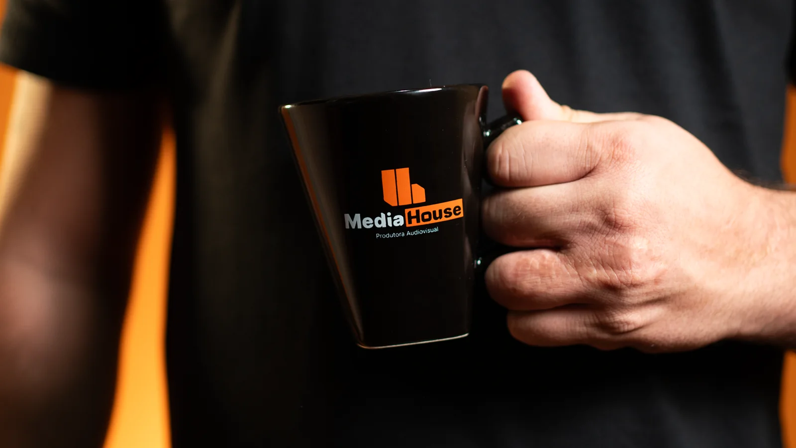
The system extends to business cards, stationery, a welcome box, tickets, the crew T-shirt, a cap and a mug.
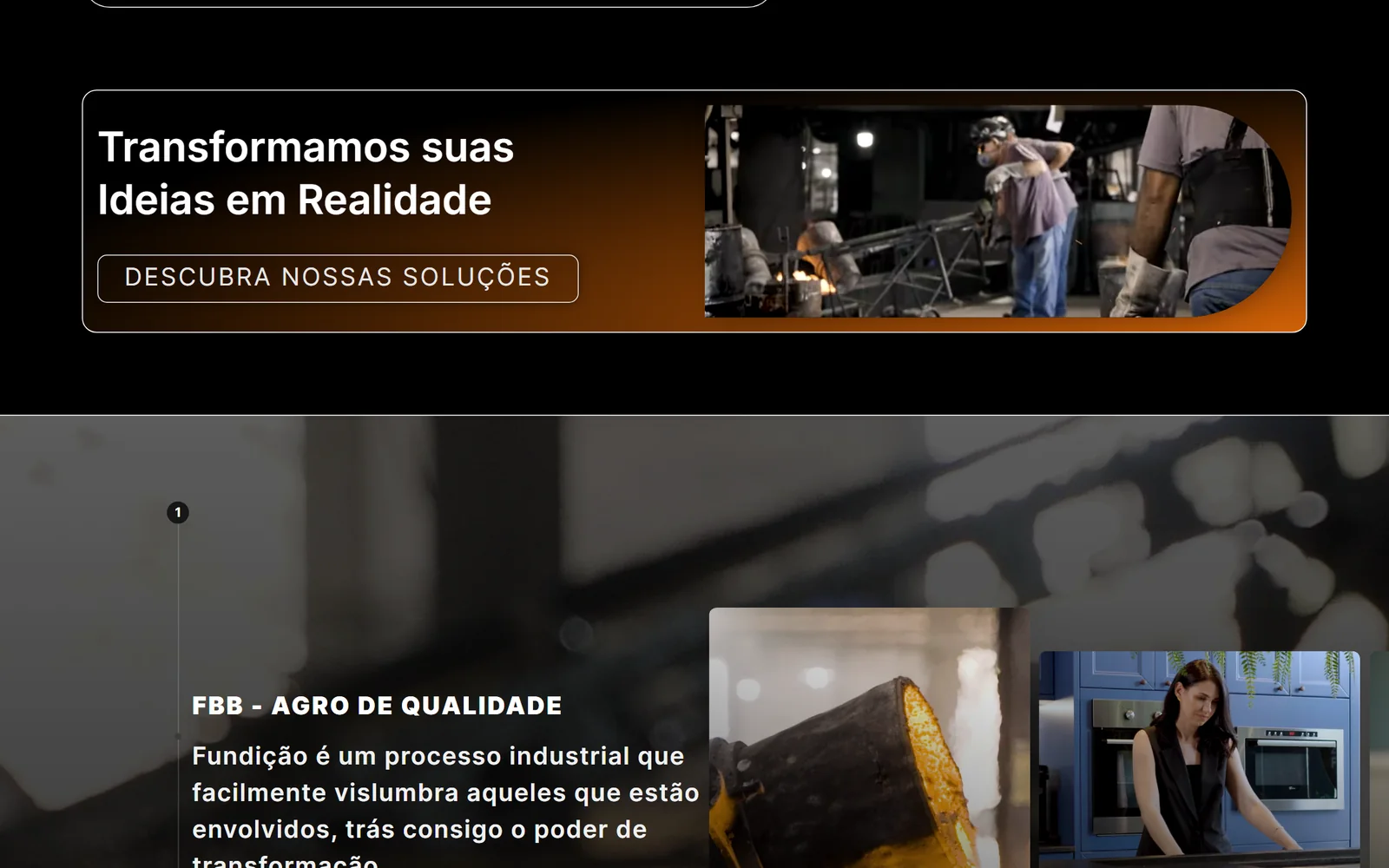
The lhmediahouse.com.br website presents the company, the delivered projects and the solutions, and leads the visitor to a quote request: a form with project type, description and contact preference.

Complete visual identity, brandbook, stationery, applications and a corporate website, live.
Results data: not available for this project.