← All work
2026Case 4/5 · Entre

Helping customers compare internet plans and sign up online

Architecture, UX and UI for the new Entre Internet Premium website.

Duration
~6 weeks
My role
Information architecture, UX, UI and website content
Team
Me, 1 developer and the Entre marketing team
Scope
Home · plans · institutional and support pages · social media
Platform
Web
Live
entre.net.br
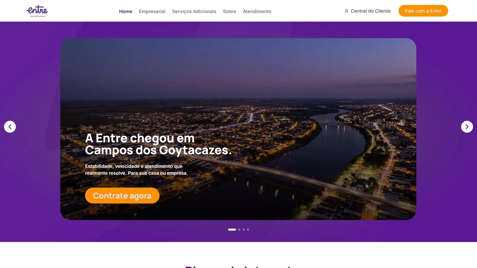
Entre website home with the announcement of its arrival in the city
Entre website home, live at entre.net.br.

01If you read only one part

A single CTA above the fold: “Contrate agora” (“Sign up now”). Comparable plans, with the promotional price and the condition on the same card. Website and social media in the same language: purple base, orange only for the action, mascot Eon.

↳Challenge and solution

Challenge

Make a visitor understand which plan suits their use and sign up, without getting lost among promotions and conditions.

Solution

  • Hero with a single action
  • Comparable plans, recommended one highlighted
  • Promotional price with the condition next to it

02Context

Entre Internet Premium is an internet provider that promises a stable connection and support that solves problems, and that has arrived in Campos dos Goytacazes (RJ). It needed a new website to present its plans and lead the visitor to sign up.

Besides the website, I designed the brand's social content system — plans, commercial dates, streaming and referrals — with the mascot Eon.

The website is live.

03Problem and goals

Whoever wants to sign up User

  • Needs to find out quickly which plan fits their use: gaming, remote work, streaming.
  • Distrusts promotional pricing: wants to know how much they will pay afterwards.
  • Homes and businesses have different needs.

Entre Business

  • Convert visits into sign-ups.
  • Serve residential and business audiences on the same site.
  • Highlight the main plan without hiding the others.

Goals

  1. 01

    Help visitors find the right plan for their use, without scrolling the whole page.

  2. 02

    Serve residential and business on the same site.

  3. 03

    Keep the same brand from feed to website.

04What I did

01

A first fold with a local message and a single action

UserBusiness

The hero says where Entre has arrived and offers a single CTA — “Contrate agora” (“Sign up now”). The menu has five items and two fixed shortcuts: Customer Center and Talk to Entre. Orange is reserved for the main action; the brand purple is the base.
02

Comparable plans, with the recommended one highlighted

UserBusiness

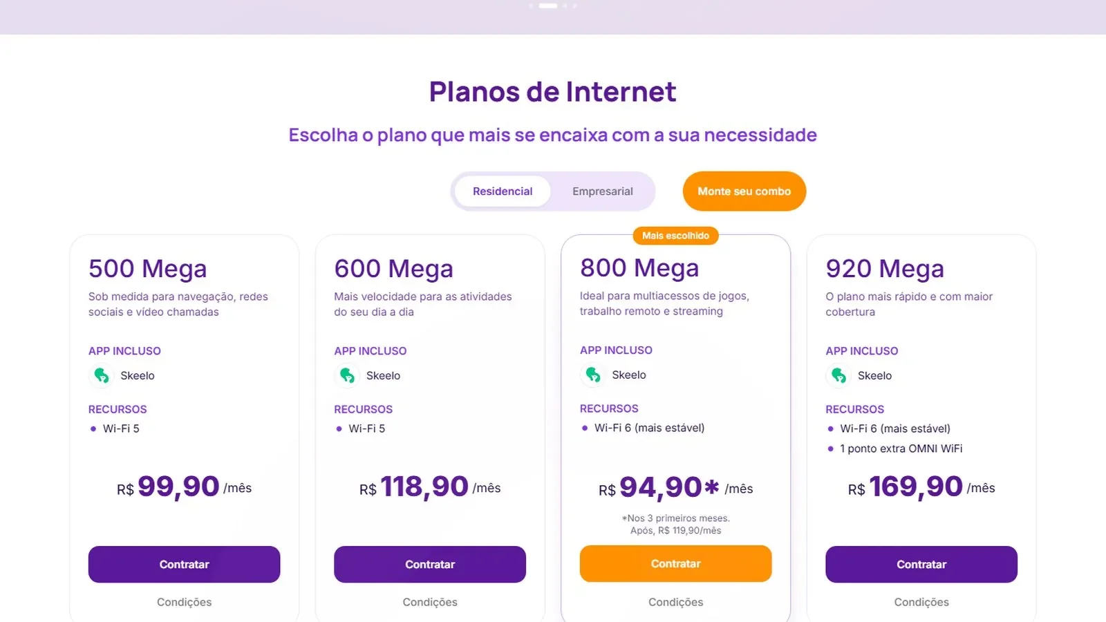
Four plans side by side, each with the ideal use, included app and features. The Residential / Business toggle swaps the list; “Build your combo” serves those who want to customize. The most chosen plan gets a badge, border and orange CTA. The promotional price comes with the condition attached — “R$ 94,90* for the first 3 months. Then R$ 119,90/month” — so whoever compares sees the real value before clicking.

Internet plans section with 500, 600, 800 and 920 Mega, a residential and business toggle and the 800 Mega plan marked as most chosen
Plans: ideal use, features, price and condition on the same card.
03

The same language on social media

Business

The social content system uses the same palette and the same mascot as the site, so the brand is recognized from the feed to the sign-up.

Four Entre posts: 800 Mega plan, cheap internet, mascot at a festa junina and a World Cup promotion
Posts for plans and commercial dates.
Four Entre posts with the mascot in a stadium, a message about uninterrupted connection, games and streaming
Posts about connection, games and streaming.

05Process

  1. Week 1

    Discovery and architecture

    Conversation with the Entre team, site map and what each page needs to say.

  2. Week 2

    Wireframes

    Home and plans first, because that is where the decision happens.

  3. Weeks 3–4

    UI and content

    Interface in purple and orange, short texts and the price with the condition next to it.

  4. Week 5

    Social media

    Post system with the mascot Eon: plans, commercial dates, streaming and referrals.

  5. Week 6

    Review and launch

    Adjustments with the team and the site goes live.

06Results

1

main action above the fold: “Contrate agora”

4

plans side by side, with ideal use and real price

2

audiences served on the same site: residential and business

Delivered

Complete website live, with home, residential and business plans, additional services, about and support.

Being measured

Conversion and traffic: no data to share yet.

07In hindsight

What worked

  • One CTA above the fold: the page says what to do without competing with itself.
  • Promotional price with the condition attached: whoever compares sees the real value before clicking.
  • Same mascot and same palette on the feed and the website.

What I'd do differently

  • I'd have instrumented conversion per plan from day one: today there is no data to compare.
  • I'd test the Residential / Business toggle with real visitors.
  • I'd document the website's components so the Entre team can edit without me.

08My role and team

Me

  • Information architecture and site map.
  • UX and UI of the home, plans and institutional pages.
  • Content and copy for the plans.
  • Social content system with the mascot.

Team

  • Entre team: offer, prices and commercial rules.
  • Development: implementation of the site from the design.