← All work
2025Case 5/5 · Amplie

Bringing a person's credit cards together in a single app

Brand and interface of a fintech that brings together the limits of several cards.

Duration
~10 weeks
My role
Brand strategy, identity, illustration and product design (UX/UI)
Team
Me and the founders, with 1 developer
Scope
Branding · onboarding · card registration · home · graphic system
Platform
Mobile app
Status
Delivered · no usage data
Amplie app screens: onboarding, home with unified limit and identity verification
App screens: onboarding, home with unified limit and face registration.

01If you read only one part

One idea per screen in onboarding: unify limits and split purchases into up to 12 installments. Biometrics without blocking: “Enable now” or “Enable later”. A layered brand, from the card to the interface: blue gives energy, the UI stays sober where it matters.

↳Challenge and solution

Challenge

Make a young company look trustworthy, and the proposition — unifying cards — understood in seconds.

Solution

  • Onboarding in two screens
  • Optional biometrics, without blocking
  • Home with the unified limit
  • A layered brand, in the interface too

02Context

Amplie is a fintech built on a direct promise: bring together, in a single app, credit cards that today live in separate apps.

A brand and product project together: I designed the identity and the app screens so they would look like they came from the same company.

03Problem and goals

Someone with several cards User

  • Needs to open several apps to know how much they have spent and how much they can still spend.
  • Handing biometrics and card data to a new app requires trust.

Amplie Business

  • A young company needed to look trustworthy without looking like “one more blue bank”.
  • The proposition had to be understood in seconds, still in onboarding.

Goals

  1. 01

    Make the proposition understood in seconds, still in onboarding.

  2. 02

    Build trust in the sensitive moments: biometrics and card registration.

  3. 03

    Look trustworthy without becoming “one more blue bank”.

04What I did

01

Onboarding that explains the proposition in two screens

UserBusiness

“Unify your credit with Amplie” and “Split your transaction into up to 12 installments”. One idea per screen, an illustration that warms up the brand, progress by dots and “Skip” always visible.
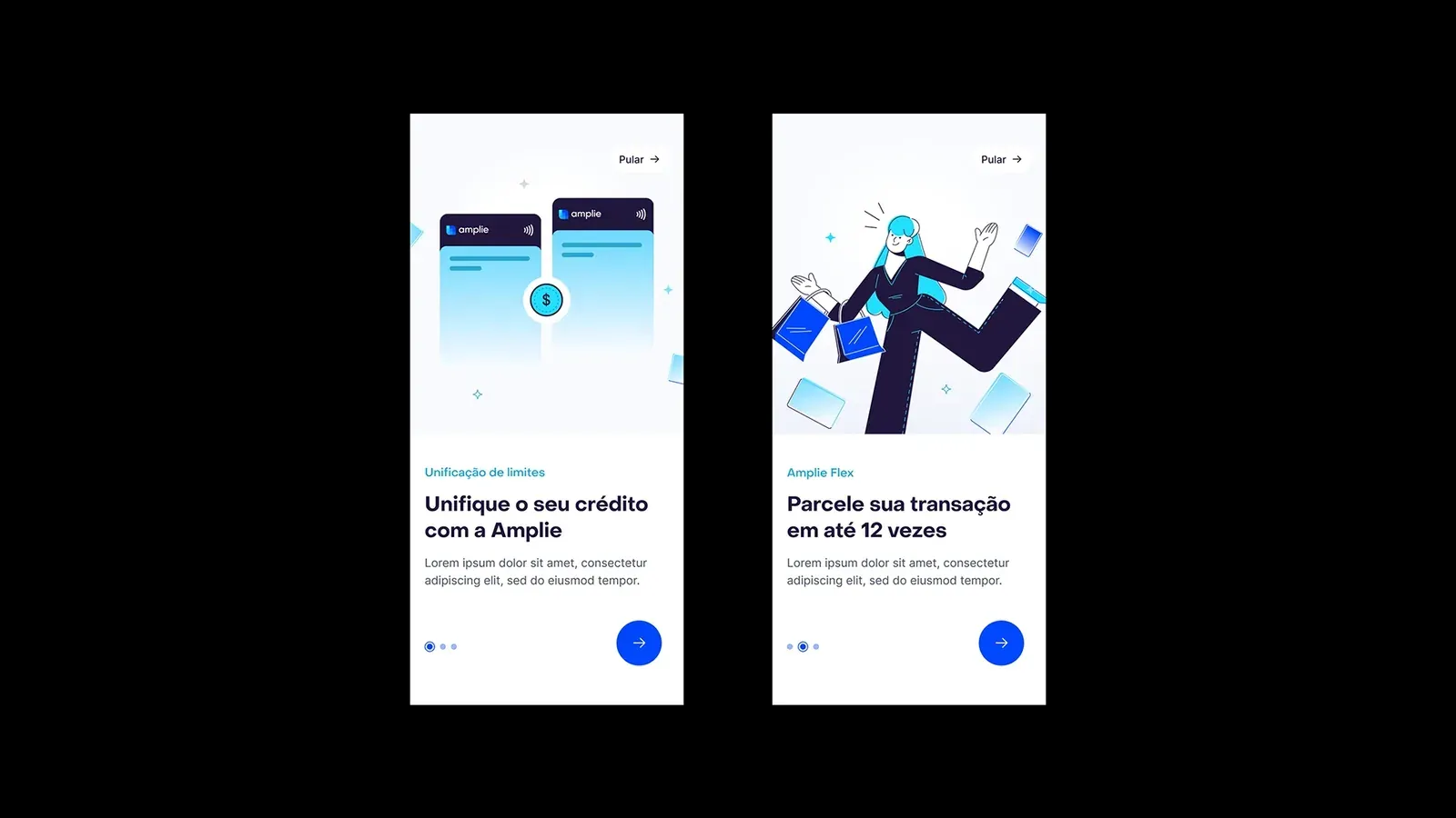
Two Amplie onboarding screens, one about unifying limits and one about splitting into up to 12 installments
Onboarding in two screens. Supporting texts are presentation placeholders.
02

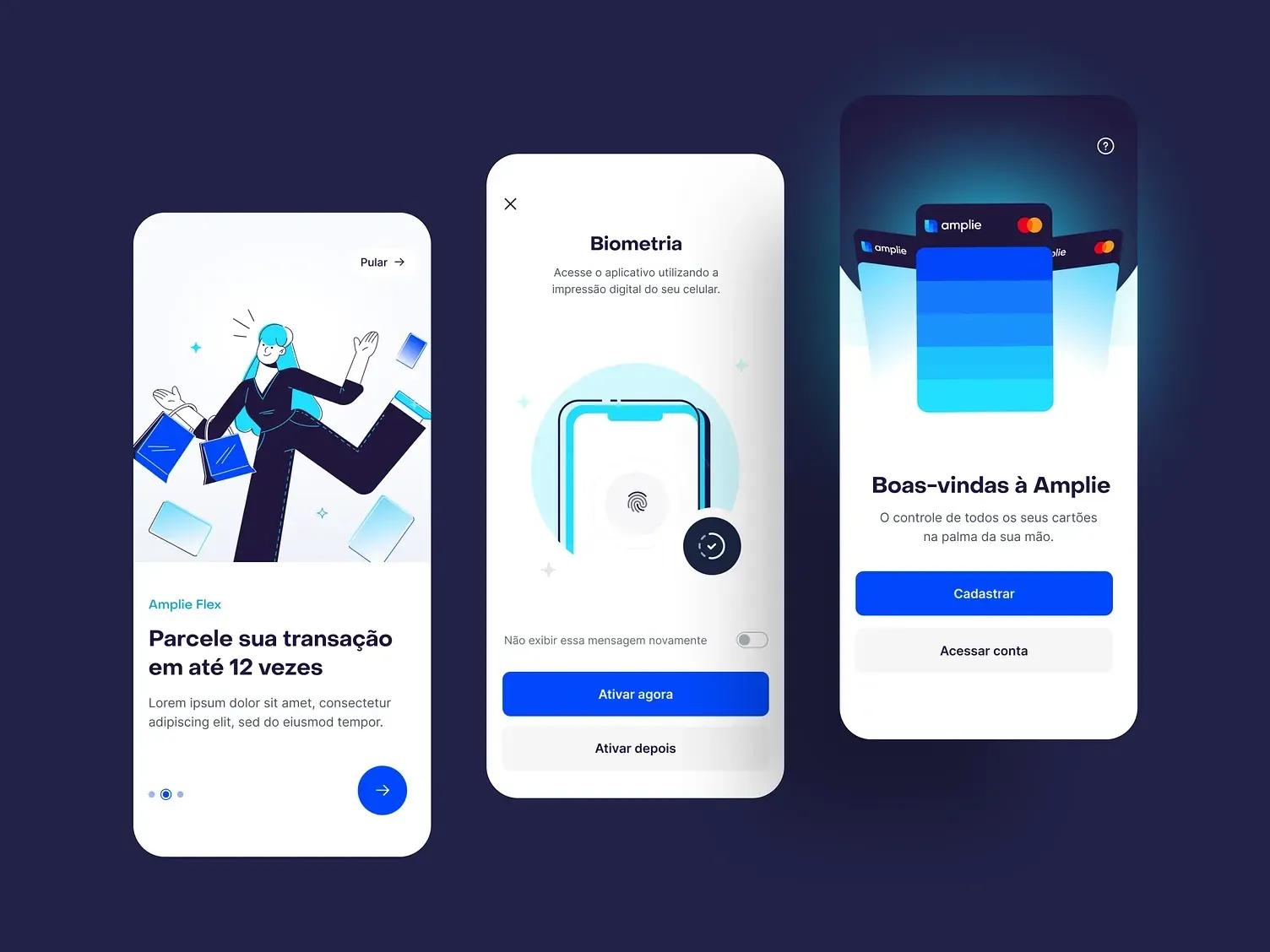
Biometrics without blocking the user

User

Biometrics activation offers “Enable now” and “Enable later”, and doesn't show the notice again. Face registration explains why the data is used and guides the capture — “choose bright places”, “remove accessories” — so the photo comes out sharp.

Three Amplie screens: onboarding about installments, biometrics activation and welcome
Onboarding, biometrics and welcome.
03

Registering the first card in 3 steps

UserBusiness

Complete the details, verify the card with a small charge on the statement and start using it. The screen ends with “Secure environment”, reinforcing trust at the most sensitive moment.

Identity verification, welcome and first card registration screens of the Amplie app
Identity verification, welcome and first card registration.
04

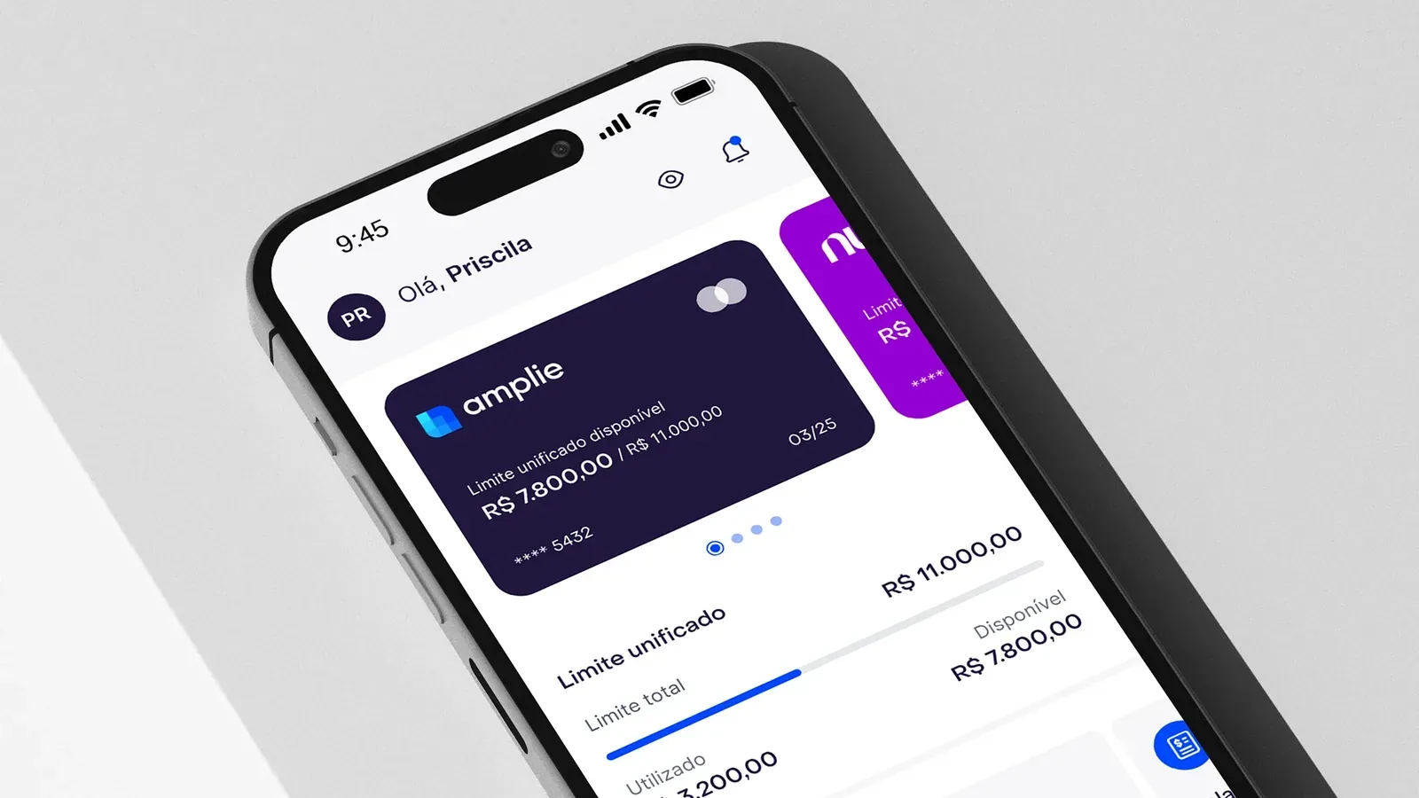
A home with the data that matters: the unified limit

User

The main card shows the unified available limit (R$ 7,800 of R$ 11,000) and, right below, a bar with total, used and available. The bottom navigation brings together Home, Wallet, Transactions and Amplie.

Amplie app home on a phone, with the main card and the unified limit bar
Home with unified limit.
05

Brand as a system of layers, in the interface too

Business

The idea of layers — cards that merge into one — becomes bands of blue that organize the brand and show up in the app. Vibrant blue gives energy; the interface stays sober where it matters: limit, amounts and actions.

Amplie cards in layers of blue on a blue background
The idea of layers applied to the cards.

05Process

  1. ~2 weeks

    Strategy

    Diagnosis, positioning and archetype: what Amplie promises and to whom.

  2. ~1 week

    Naming and voice

    Name and verbal identity for a proposition that fits in one sentence.

  3. ~3 weeks

    Identity and illustration

    Layered system in blue, modular shapes and an illustrated cast.

  4. ~4 weeks

    App UX/UI

    Onboarding, biometrics, card registration and home, in parallel with the identity.

  5. ~1 week

    Applications

    Cards, outdoor media, giveaways and stickers.

06Results

2

onboarding screens, one idea in each

3

steps to register the first card

1

unified limit on the home: the data that matters most

Delivered

Complete identity, app screens (onboarding, biometrics, card registration and home) and a graphic system with illustrations.

Being measured

Usage data: not available for this project.

07In hindsight

What worked

  • One idea per screen in onboarding: the proposition fits in two screens.
  • Optional biometrics: the user doesn't have to decide under pressure.
  • The illustration warms up the brand without taking away the seriousness of the numbers.

What I'd do differently

  • I'd test with users the card verification by a charge on the statement, the step with the highest risk of drop-off.
  • I'd measure registration drop-off per step: today there is no usage data.
  • I'd document the app's components together with the identity.

08My role and team

Me

  • Brand strategy, naming and verbal identity.
  • Visual identity and graphic system.
  • Illustrations.
  • Product design (UX/UI) of the app.

Team

  • Founders: product proposition and credit rules.
  • Development: the app, from the design.